Episode Transcript
[00:00:06] Speaker A: Cracking Copy is a marketing and copywriting podcast where we lift the lid on writing for business and read between the lines of effective copy.
[00:00:16] Speaker B: This is a podcast for creative entrepreneurs and savvy business owners like you who understand the value that great copy can bring to their bottom line.
[00:00:24] Speaker A: We dive into a different aspect of writing for business in each episode. Debunk the myths about how we should write and explore the ways that writing can be fun, conversational and creative while also being high impact for serious results.
[00:00:40] Speaker B: So listen, laugh and learn with us, Ella hoyos and Minnie McBride as we share our words and wisdom in each snack sized episode. Expect some light bulb moments, interesting guests and practical takeaways as we crack the copy code together.
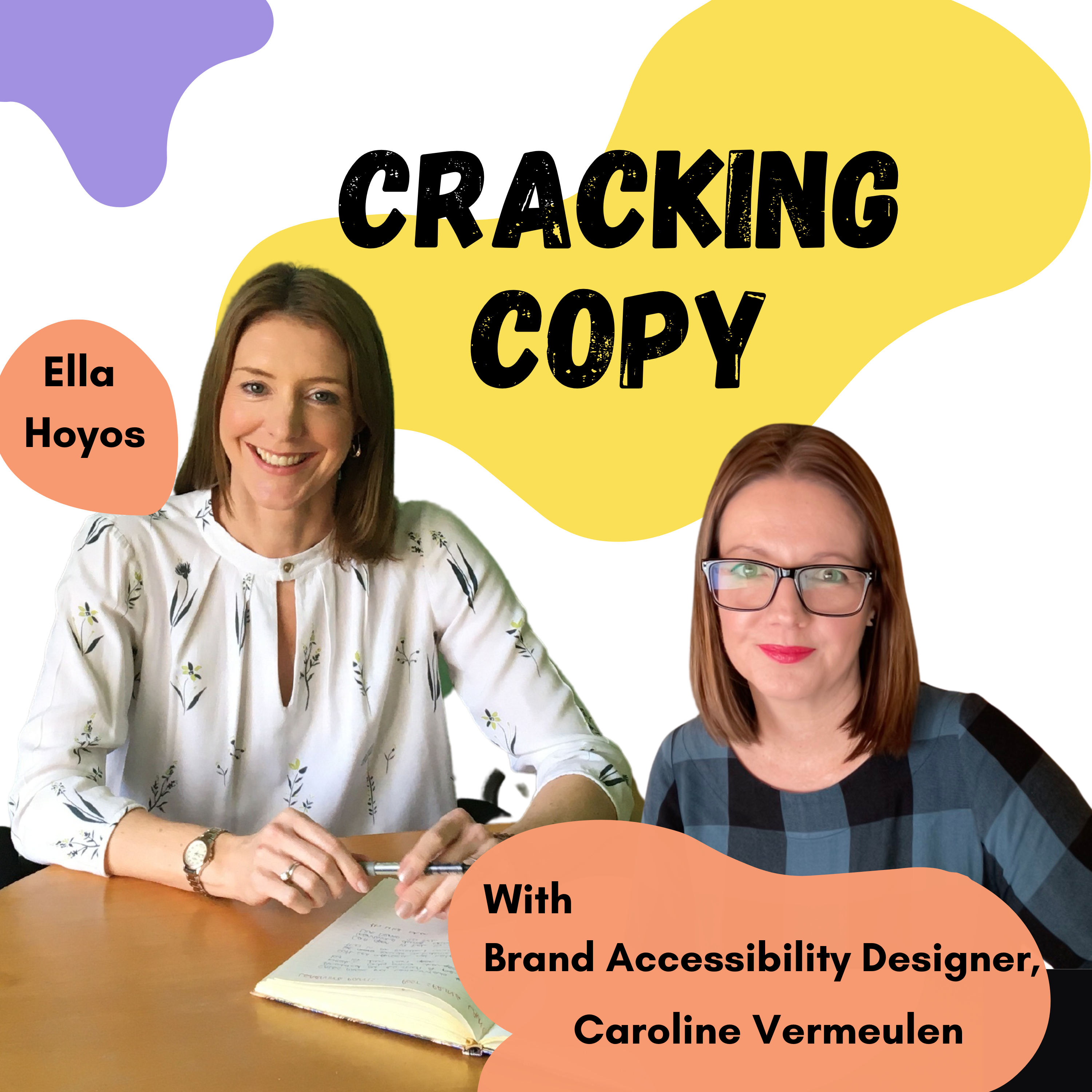
[00:00:58] Speaker C: Hello and welcome to Cracking Copy. Name is Ella Hoyos and today I am joined by Caroline Vermeulen who is a graphic designer and branding specialist with a particular focus on accessibility, user experience and neurodiversity. So I know you work with Neurodiverse clients and you design for Neurodiverse audiences. So I really want to dive into this today because much as I would say copy is important in any sort of materials that you produce for your written materials you produce for your customers, so is the design element. So over to you Caroline, tell me a little bit about yourself and then and your design background and then let me ask you.
[00:01:43] Speaker D: I'll try and keep it short because I'm a gabber, but yeah, totally agree with what you said. I've always thought that copy and design work hand in hand and that not one is important, more important than the other. And obviously normally the designer thinks the design is important and the copywriter thinks the text is important. But. But it's definitely a marriage between the two. And also as I've learned through my work history, like brand tone of voice and text, a copy tone of voice needs to marry as well. But yeah, my history let me try and think. I got trapped in retail for ages as you do because it's so easy to progress. And then I remember I was working at Crabtree Newland and I was like why am I here when I have a degree in design? Why am I selling soap? So I started doing any day off I had or evenings. I kind of worked for free for a local design agency. And then eventually they hired me and I insisted it was as a junior because I didn't want the pressure because I was like, I don't know what I'm doing. I haven't really done it in ages. So I need time to kind of Practice and then jump ahead. And I ended up in guide dogs, which was really amazing. I remember always saying that, oh, I must be really good at design, because I designed for the blind.
But it was very much about their core audience and the considerations you take. So font size, I think, started, if I remember, at 12 points, and standard is 10 points. And then headings would, like, jump up higher and higher, so everything was enlarged. And there was also a big focus on accessibility for visual impairment is what they called it, because there's only a small amount of people that are actually fully blind. It's actually a lot of, like, eye conditions. And I was amazed to know that colorblindness was one of them. And there's a huge percentage. I forget the number. But colorblindness in men, it's, like, really high. And then, of course, when I started wearing glasses, I was like, oh, okay. So I'm also part of the visual impairment audience because it's everything. It's things like, considering your print job needs to be printed on matte paper instead of gloss because the reflection makes the text hard to read.
[00:04:00] Speaker C: Yeah.
[00:04:01] Speaker D: And then it was about layout as well. So understanding that large unformatted text is super hard to read for visual impaired people, but also just for anyone age, like, 30 and above that wears glasses, I'm like, well, that's a huge amount of people. It's not just a small, tiny audience, but. And then from there, we learned about dyslexia on a small scale and more about contrast ratio and understanding that a white background and black text or dark text on top was. The contrast was too high for some people, especially for dyslexia dyslexic people.
[00:04:42] Speaker C: Yeah. Now, that's what you're saying is really getting into the nuances, the small details that we often overlook, like the fact that the majority. Anybody who wears glasses is deemed on the spec, visually impaired in some way. And that as well.
[00:05:01] Speaker D: Yeah.
[00:05:01] Speaker C: And most men as well, with the colorblindness.
[00:05:04] Speaker D: Yeah. Yeah. So I was, like, fascinated by it because I'm, like, such a dork. And we went on, like, an accessibility course. It was just like a day course, and we learned some stuff there. And then we went to a. Not a webinar that's online, an actual talk. So a inr.
This guy, Eric Speakerman, was talking, and if you're a dog like me and you watch the Helvetica movie he features on there, he hates Helvetica and our guide dogs. Our brand font was Helvetic Inu and I was like, oh, crap. Like, this is awful, because he's saying it's so difficult to read. And I was like, well, I have to know why, because that's like a brand font. Like, we are failing at the first hurdle. So I remember putting my hand up in, like, an auditorium of, like, a thousand people, and I said, like, what is it about Helvetica? And does it apply to Helvetica? Knew that is, like, eligible. And I can't remember most of the answer because I was just, like, terrified because I was like, everyone's staring at me because I've asked a question.
Do you remember? He said it's about tracking, which is a space between the letters, and leading, which is the space between the lines of text. Not to use the default, because that's mathematically correct. But we don't read, like, optically. We don't read from a mathematical equation.
So I was like, okay, that's amazing. So it's making sure that the spacing is big enough, and that has implications on personality. So if you design for, like, a beauty salon or a spa, you'll often see really thin type with, like, large spaces between each letter, clear and calm and all of that stuff.
[00:06:48] Speaker C: So is that a good thing, to have that spaciousness between the letters?
[00:06:53] Speaker D: Yeah, for dyslexic people, especially, because they need kind of time and space to work out the letters because their brain is moving so fast and in such a different way to neurotypicals that you've kind of got to consider the way that they look at things is so unique and amazing. But it's stuff like. And this was confirmed on a recent course that I went on, I was like, oh, I knew all this stuff from guide dogs, but I forgot that I knew. And I've been doing it, but not actually knowing that I'm doing it. Specifically, it's letters like the I'll use the B and the D, but it also applies to the P and the Q. If you flip the B and the D on top of each other and they look exactly the same, then it's difficult for ne, ne, ne diverse dyslexic people to differentiate them. So instead have, like, maybe the D has a little flick on the bottom and the P and the Q. In Helvetica, they use, like, the straight down or the straight up, the Q just put that flick back on to differentiate. So it's stuff like that. It's also spacing as well.
[00:08:00] Speaker C: Yeah, that's really interesting. I. You see this in children who are learning to read as well and learning to write, because often they'll flip their P's and K's, D's and B's, and they have trouble because they're seeing it as one and the same.
A particular example that springs to mind is my. My friend Tracy, who is tidying her daughter's desk and she found a little note that said. And she looked at it, bad mum.
[00:08:28] Speaker D: But.
[00:08:29] Speaker C: And she was like, my daughter thinks.
[00:08:31] Speaker D: I'm a bad mother, but what's dad and Mom?
[00:08:35] Speaker C: Yeah, it was dad and Mum. So.
[00:08:39] Speaker D: But yeah, I remember that from my daughter learning how to write where she, like, flip letters. And they do do that, and it kind of comes right later on down the line.
I think the thing as well that I've learned is that people focus on dyslexia from a point of view of the stuff that they can't do. And it's. If you design to make legibility easier for them, so that the message. I mean, my whole ethos behind design is I want it to be easy to digest. So that's why everything works together. If I'm putting images, it needs to be a snapshot of the paragraph or give you a feeling of what the text is going to be about. And it's another way to help especially neurodiverse people to actually digest the information. And by considering your dyslexic audiences who have skill sets in other ways. I mean, they've got such creative thinking and they can just. If they are catered to in a way that enables them to lean into the skill set they have, then there's like, no stopping them. But it also affects everyone in such a positive way. If you make text easy to read for what could potentially be considered your lowest common denominator, which it isn't. If you are catering to an audience like colorblind men or dyslexic people or people in your diversities, and you're just creating really good design, that message benefits way more people. And from like, a sales point of view, like, why wouldn't you want your brand to be seen by as many people as possible? And that can actually pay you money to buy your products.
[00:10:13] Speaker C: Absolutely. And the other important factor there is that our attention spans, as we all know, are worse than a goldfish these days. You know, we have a very short amount of time before we're scrolling on, moving on to the next thing because we're constantly bombarded with messages. So the quicker and faster you can digest the message, your audience, just the message, then it's A win for. For you as a company or a brand. Who is communications out there? Because it's actually.
[00:10:39] Speaker D: Yeah, exactly, exactly. And I thought I was in the same boat. I would say to clients, you know, I'm your worst possible customer because I have an attention span that's so short. I represent the masses out there. Until I figured out that, oh, actually I'm adhd.
My attention span is impacted also by my neurodiversity. But, yeah, we've got too much stuff, and you've got to kind of declutter the mess in our lives to be able to digest the important stuff and to scan and find what's important to you. And if you've got good design and good copy, you're just making that job so much easier for them.
[00:11:18] Speaker C: Yeah, yeah. Now, I think as a designers go, I don't know how much of a rare breed you are, but I think you are, because I don't. I think designers still often are very focused. Now, I can't speak for everybody, but often the assumption is they're focused on the aesthetics and how it looks and the fancy fonts and all the rest of it. But, no, accessibility is really crucial for all those points that you mentioned.
[00:11:42] Speaker D: For sure, I'm not super rare. I just have kind of figured out, and I'm celebrating the fact that I figured out this is where I was going, but I didn't realize there's so many stuff has fallen into place, like me finally knowing I'm adhd. I'm not even two years into my diagnosis, so I'm late diagnosed and then getting to grips with all of the stuff that comes with that and looking back and realizing, like, oh, okay, I'm not the weirdo. I just have a unique brain, which isn't actually that unique because there's a lot of neurodiverse people out there. But the talk I went to, I think it must have been like a month or two ago now. And there were a lot of designers at that talk talking about accessibility around design as well. And it. It's difficult, though, because as a young designer, you're just trying to get. Get your skill set good enough to create stuff. And then the knowledge comes later and the confidence comes later to figure out, like, oh, actually it works together. And I never understood how marketing departments and design departments were always across the hall or, like, in different rooms, because I'd be like, that's a marriage as well. Like, I want to know the data to see if my advert worked or my design actually worked. And how it worked and what it means.
So, yeah, I think I'm just a dork. I don't think I'm different. I'm just a colossal nerd.
[00:12:58] Speaker C: Oh, you're just passionate about what you do and you want it to get results. You want the outcomes. You want to know about this, which is great. Now, when you work with clients who bring. Who either provide you with a copy or you work with copywriters to create your material, do you give them advice on what they, you know, or do you wait for it to come in and then see what you can do with it? Or what. You know, what, what advice can you give to copyright?
[00:13:27] Speaker D: I'm laughing because I'm like, such an interfering cow. But my, my, my motivation is always for the betterment of the design on a whole. And I have had clashes with, like, writers in the past because, like I said to them, like, we need two words removed so that the paragraph line endings can be neat.
And it's that. And I didn't have the language before to describe, like, actually, we're helping the reader to read by the shape of that the words form. If you actually control your line endings to make it neat. So it's following the line of the curve of a capital D. So you've got a shorter line at the top, it gets fuller and fuller in the middle and then reduces down again because you're helping the eye to track the text. And of course, you know, copywriters value language. And so for them to edit something, like, I've put all my passion into this and, and it's the same as when a designer gets feedback and I'm like, oh, for goodness sake. I either have to defend my choices or bow down to what they're asking me to do. So it's always, like, a bit tricky. But I definitely, if I have clients, and a lot of them are small clients that don't use copywriters, so they already start off at a disadvantage. And they send me texts I'll go through and I will just try and be as kind as I can with my ADHD bluntness and just say like, oh, this is very jargony, or you've made the language very complicated. And. And your brand is supposed to be, like, approachable and conversational. And. And so think about things like, if you are super approachable and super friendly, then use contractions. Instead of saying, I am not going to the shops, you say, I'm not going to the shops. Or, you know, or I did not change it to I didn't I don't know, I always go into the negative words, but it's the ones that come to mind and just think about those and think about the text is also explaining something in the background, just as brand does. Like you are selling your knowledge base, your quality of product or service and your language also needs to reflect that because you're creating a perception all the time that you then have to meet. Like that's the hard job.
So I do have to do a lot of communicating. I'll go through and oh, I've changed this and this and this. And here's why. If you don't like it, I'll put it back.
So I think I probably undercharged because I shouldn't really be going to copy. I should have a proofreader like someone like you. I'm like, look at this, this is the brand tone of voice.
Can you change this? And then we'll get like the clients buy in or like sign off or whatever.
[00:16:06] Speaker C: Yeah, that's important. And yes, you definitely should be charging or just, you know, that is absolutely. A distinct part of the process is the copy editing and the briefing and guidance. If there's not a professional around and even if there is a professional, I think that you explain it really well.
And I think once people understand, because not everybody sees understands these accessibility issues, but once you've explained to them this is how it's going to be received and here's why, then I think it becomes quite obvious.
[00:16:40] Speaker B: It's like, ah, right, I get it now.
[00:16:43] Speaker D: Yeah.
[00:16:44] Speaker C: And another thing is difficult for I think feels a bit abstract is, you know, understanding the composition and the flow of how the eye moves. Because we're not, you know, we just do it automatically, don't we? Our eye just moves automatically across a page.
[00:16:58] Speaker D: Across a page, granted.
[00:17:00] Speaker C: Yeah. And so understanding this is where the designer or the artist comes in. Understanding how something.
[00:17:06] Speaker D: Yeah, and there's a word, there's a term for that as well, which I love is information hierarchy. So creating those patterns. So I think when people go online, you don't even realize how you are conditioned to understand format. You just go through and you know instinctively how to scan a page to find what you're looking for.
But that means that everyone has to follow those rules and not everybody knows the rules. So. So like for any kind of website design that I do, I say to people like, you know, you have your menu bar at the top, you repeat it down the bottom. Because sitemaps are the way that we used to have the website designed. But People still rely that if I want to contact someone, I don't want to hunt for the contact page. Or if I want to see the T's and C's, I know to go straight down to the bottom to the footer, because those should live there. So I always say legals should be down in your footer and everything in your menu you repeat down the bottom except for your sub pages and even just on a page. Design hierarch, super important. You need to define the look and the font weight of your heading. And then you have the size reduced and potentially the font weight changed for your subheading. And then have something different, maybe by color and weight and size for your intro paragraph. And then your body copy or your paragraph text needs to be in one kind. And then, you know, might seem boring. I think people that aren't brand specialists or designers, they want a little bit of creativity and they forget that. Actually it seems boring to you because you live and breathe your brand, you see it every day, but your potential client has like one or two touch points. And if you're already changing things because you want to have a creative outlook, what you're doing is breeding mistrust. Because they can see something is not quite right, but they don't know what. And so by being inconsistent, by not following some sort of structure in your text to help people read it, or even by changing your logo every time, because maybe you type out your logo instead of having it as an image file, then they start to see the differences and they don't really get it. They're trying to learn who you are. So all of this stuff comes together to be really impactful. And it might seem boring, but it's super, super helpful for the reader to have information hierarchy laid out in a pattern.
[00:19:30] Speaker C: And that is almost happening by the sounds of it on a subconscious level. Then again, not something you articulate, it's just something that feels right or feels wrong.
[00:19:40] Speaker D: And we're conditioned by all the tech that we have. The people are doing that the same way. It's then when you get somebody entering in it who doesn't have the skill base or the knowledge, then they change all the rules. And I always say, like, you know, you can break the rules, like with color theory, you can make your logo pink if you're a funeral director, if you have like a really strong story about why, because then you'll stand out for the right reasons rather than standing out because people are like, why are they a pink their funeral director? I don't want to have my grandmother buried in a bubble gum.
Like, what is it called that. A flask coffin.
[00:20:19] Speaker C: Yeah.
Yeah. So in copywriting terms, we, we, yeah, we think about messaging hierarchy, design terms, information hierarchy. And actually I'm thinking about it as I write and that messaging hierarchy is a similar concept, is where you get the most important message up front and center and then the additional information that supports key messages follow snapshoting as well.
[00:20:46] Speaker D: Like they're heading in. The subheading should be snapshotting what people can expect from the rest of the article so that people decide to take the time to actually read it all. And so it's a very important job because you've got to kind of sum it up in hardly any words. And that's a skill that I don't have.
So, I mean, I try to help, but yeah, having like a, a seasoned copywriter that understands how people read and how to get a message across and expectation as well. Like, a lot of people send me stuff and I'm like, okay, well what's your call to action? And oh, what's that? I was like, well, what do you want to do when somebody looks at this like, flyer, you know, because you're paying for this. So you need a.
Sounds so smar me, but you need a return on investment, especially if you're a small business. Like, you want every cent you spend to turn into something. So when people come and say I need a flyer, I was like, I'm like, whoa, like, what are you trying to do? Like, what's your goal? Is it actually a fly you need or is it a D flip? Because it's also about impact and like real world user experience. If people are given like A, an A5 flyer, but the audience is mainly women that have only bought a small purse with them that's going to get chucked in the bin. So give them something that can handily go into the bag. And obviously I use women as, as an example because I am one. So that's the kind of stuff I think, like, you know, maybe it's better as a postcard because moms are more likely to pin stuff on their fridge, so they're more likely to keep seeing your brand every single day. And same again with text. Like, what's your call to action? Give clear instructions on what you expect and help clients to be confident to know how they can contact you. Put your email address first. If you're not great on the phone, but have the phone there because maybe they're better on the phone. All of that stuff, which I'm sure that you take into account when you write your copy.
[00:22:41] Speaker C: Yeah. In fact, it's almost, you know, so ingrained in me having a call to action that. What action do you want your reader to take next? What do you want them to do? Is it book a call? Is it sign up to a newsletter? Is it, you know, visit your website? What is it the, the thought of somebody producing, going to all that trouble and expense to produce marketing material that doesn't have that.
[00:23:02] Speaker D: Exactly, exactly. And even like social media, you need that marriage again about text and, and design, because I know social media, a lot of businesses use it. But what a lot of people forget is like if you are just every part of your Instagram grid is product, product, service, service, sale, sale. You've got to scatter in entertainment and inspirational quotes or client testimonials. Not everything can be a push for sale because it's off putting. People are on social media for light relief, for a bit of entertainment, and you need to provide that because clients as well, or customers or consumers, all three of them, we want to change the world in a positive way. We know that our purchase makes a difference to a small business or to the world as a bigger whole. So everyone wants to see, like, okay, why am I buying into this particular product when there are 50 others there?
[00:24:00] Speaker C: Yeah.
[00:24:01] Speaker D: What are they doing to like, what is a brand personality? And that's always how I start off branding projects is I define the personality first, add the humanity in and then everything is an extension or an exaggeration of that tiny message of like, okay, this is your main personality. So the colors we choose, the fonts that we use are a reflection of that because your brand needs to work as a whole and needs to be cohesive. And that's again where like text comes in. Like if all of a sudden, you know, you're a very casual brand, but your text is like hence and thalf and henceforth and whilst and all this like language that's very corporate and legal. It doesn't make any sense. Like, everything has to match.
But your creativity can be expressed in other ways in the business that you do. So I always find it hard when I work with customers because I think that, you know, graphic design is a creative job and it is, but it's strategic creative thinking that makes design really good. And the marriage between that and the text, which also should be creatively approached with strategy as well, which sounds like what you do. What's your call to action? What do you want the result to be?
[00:25:16] Speaker C: It's important it is just bringing it back to accessibility again and social time how one thing you said early on in our conversation is about contrast. I was always led to believe that black and white is the best contrast. Or actually also I think I might have done some accessibility training at some point during my career. Yellow, black on yellow is a good contrast. But actually something you said earlier is it's not always the way.
Can you just give me some highlights on what people can do when posting on social media with images, with captions? How can we make that more accessible for our audience?
[00:25:57] Speaker D: So there are tools out there. So I think if you search I can't I can even remember names. But I think if you Google something like web contrast ratio, you can find a bunch of websites that just you put in the hex code of your color of your text and the color of the background and it'll give you basically give you like a pass or fail. I. I can never me with my ADHD and numbers, I can never remember what good number is but you can find it somewhere. I think it's something like 4 colon 1 is like a really good place. And then if you've got something that's too close together for both numbers, it's a bad contrast.
[00:26:37] Speaker C: Yeah, the high numbers are the sort of maybe the dark tones and the light. The low numbers of the light.
[00:26:42] Speaker D: Well, the contrast is too high between the two so you'll get like a pass or a fail. And it has like a little list of, you know, for, for headings. This is good before, before paragraph copy, not so much because the tools are considering size of the font, weight of the font. So I had a client who said like oh, these colors are not. Don't have a good contrast ratio. And I was like yes, if you to use that color as text on a white background, it wouldn't. But the intention and what's in the document is you use a bold version of the text on a button. It's only used for buttons, which means that the contrast ratio for that specific item is perfect. Now for websites and anything digital, the idea to be as inclusive and accessible as possible is to have choice. So to enable the user to change what they're seeing, to be flexible in that way. That's the best way to do it. There are tools out there so I use userway on mine. But a word of warning, they're very pushy. Salesy. I've only got the free version because I'm like I'm still changing my website. It's going to take Ages and I'm not going to be paying the amount of money but that their market are the US market and places in Europe where it's actually illegal to not have accessibility as part of your website. So their price point makes sense because rather pay 400 a year instead of being sued for thousands. But I'm like Britain isn't like that. I just want to enable people to change then things like you said the yellow background with black text. If it's the pure yellow that again is better. But it's still quite stark for some people. I tend to go with like a cream or a khaki or like a beige background with the black text because you're softening the starkness a little bit.
[00:28:36] Speaker C: Yeah, that's probably more nicer looking than actually yellow and black bumblebee kind of thing. That wouldn't.
[00:28:43] Speaker D: Yeah, cheap yellow. Yellow is young and cheap and fast. So think of McDonald's with the yellow and the red that signifies fast and you know you don't want it to be. If it's fast it's probably cheap because they're appealing to loads of customers. So you don't want to come across. It's also still got to reflect your brand as much as possible.
[00:29:01] Speaker C: Yeah.
[00:29:02] Speaker D: But for social media I recommend that as much as possible you put in alt text. So you put in. I always put something I say always don't, don't check me because I forget the text that says like image description colonial. And then I try and describe the image and you can go as in detail or as like surface level as you can. Because sometimes the text isn't important. Sometimes it could be the actual quotes that you've had to post as a jpeg which means it won't recognize that there's text there. So your alt text gives people the opportunity to actually know what the font, sorry the font, what the quote actually says. And that's not just for blind people that use screen readers. There's a lot of neurodiversity neurodiverse people that actually use screen readers. I know my daughter who's recently diagnosed with autism. She watches a movie with the subtitles on because she needs that double layer of information because her processing is slower. And I find actually that I'm really good if I have the subtitles on as well. And my sister in law came over the other day, she's like can we switch the subtitles off? And I'm like oh great. Well I'm going to miss half the movie because I'm not reading along with the picture I did, yeah.
[00:30:16] Speaker C: And also a lot of people, even if they're neurotypical, are doing two things at once. We're multitasking. You know, we might be scrolling a phone and have the film on in the background. And I believe that a lot of people then would have the subtitles on so they can glance up and just catch the gist of what was just said if they were distracted in that moment.
[00:30:34] Speaker D: Yeah, yeah. So your intention should be again, the lowest common denominator. Like you're putting that, the LT text on for people who use screen readers because they are so severely visually impaired, that they need that. But then also just think like if that's actually not the lowest common denominator, you've actually got a very large audience set that prefer to look at stuff with their computer screen reader. Like with all of the computers you get. Now you get that ability with Word documents as well. They've got like, you can have the computer read you the text. Because I find especially with unformatted text and text only documents, I need that so that I read along while the machine is reading to me. So you actually are increasing your audience set and it's just respectful to consider the people. Like exclusivity shouldn't mean that you're excluding a large audience. You know, that's not inclusion. Inclusion is thinking about different kinds of people and how they ingest information in different ways. And it doesn't mean that you're catering to some small audience that's never going to buy from you. It's also giving a really good indication that, that you are a caring company or caring brand that's considering other people that you might not consider are part of your ideal client base. Because there's a lot more neurodiverse people out there. Mainly because, you know, I think that Covid kind of pushed us to our level of anxiety, that our neurodiversity couldn't naturally be masked, that we've been doing all our lives, especially women.
So there's a lot of people out there that need the basics, like alt text.
And also like in Instagram, it's, it's image based. So think about putting some extra text to kind of describe the image. Because the amount of times I go in and I have a look at old pictures, I'm like, what is this? Like, if I didn't see it on the day, I have no idea what I'm looking at. What, you know, you kind of want to know details about it.
[00:32:42] Speaker C: Yeah.
[00:32:43] Speaker D: Put that in your description as well.
[00:32:45] Speaker C: Yeah, no, that's brilliant. Thank you. I think the main takeaway is that, you know, and I really like what you said about brands being respectful by doing this sort of work, by taking these extra measures to make your design and copy mesh together and be accessible and to use things like alt text to describe imagery and to be considerate of. Of the contrast between colors and how they are read by people. That people's eyes respect thing. And that can only have positive repercussion on your brand and help you reach a greater audience. That maybe.
[00:33:23] Speaker D: Yeah, for sure.
[00:33:24] Speaker C: I mean, like intentionally excluding.
[00:33:28] Speaker D: Exactly. And that was what was mentioned at the talk I went to, because some of the speakers were testers, like market testers, and they were saying, like, inclusion shouldn't mean that you Excluding a different set. I was quite embarrassed as well, because one of the women said, so she's got. I can't remember the condition she has, but she sometimes has to go in a wheelchair because of it. So sometimes she's fine to walk, but sometimes she's in too much pain and her body, I think, is too rigid. And she mentioned a guide dog's campaign that I worked there for, which was called Shared Spaces, and it basically meant putting these little, like, bubbles on the floor to help the guide dog recognize that this is a stop. You need to stop the person because it's maybe like a zebra crossing. So you have to press the button. But then she said it might be shared by non blind and blind or like non visually impaired and visually impaired. But she can't. If she drives over there, those dots on her wheelchair causes her pain. And I was like, oh, you know, they've. They've included the visually impaired, but they've excluded certain disabilities. And so it's not an easy thing to. To do.
[00:34:37] Speaker C: No.
[00:34:37] Speaker D: I think you start considering one type, then you're only growing your audience. And then with time and with feedback, you then realize how to tweak so that you're not excluding a specific group. And you're trying to be as inclusive as you can.
[00:34:53] Speaker C: Yeah, that's it. It's as inclusive as you can within the constraints that we all have. And we're never going to be everything to everyone. Nobody can be that person. But we can, we can try to do. Do the right thing.
[00:35:06] Speaker D: Yes. Include people that wear glasses or color blind at the bare minimum.
[00:35:10] Speaker C: Yeah. Yeah. Well, Caroline, thank you so much for today. That's been really insightful. If people want to work with you and get their copy checked over or get their designs checked over by Accessibility specialist and branding specialist and self confessed dork. Which then how can they get in touch with you?
[00:35:33] Speaker D: You can find me in most places under my name, which is Caroline Vermeulen or Mystery Hair. Hairs in the Rabbit. So my website is mysteryhair.com so you can email me from there. I'm all over socials, I'm trying to be everywhere on LinkedIn. So you can find me on LinkedIn under mystery hair, my company page or my name, Carolyn Vermeulen, as my profile and you can connect with me there. I think that would be the best. Yep.
[00:35:58] Speaker C: I'll put all that in the show notes as well. So just click through to the show notes and then you'll be able to.
[00:36:03] Speaker D: Find Carolina, especially with my surname. Yeah, you need to. You need to have it spelled out. Yeah.
[00:36:09] Speaker C: But you've got a very distinct hair logo and then lovely graphic pattern. So I shall put the link into Mystery Hair as well, which might be a bit easier.
[00:36:16] Speaker D: Thanks.
[00:36:17] Speaker C: To find great stuff. All right, thank you so much and I'll see you soon.
[00:36:21] Speaker D: Thank you.
[00:36:23] Speaker B: You have been listening to the Cracking Copy podcast with Ella hoyos and Minnie McBride ride.
[00:36:29] Speaker A: Don't miss out on future episodes by making sure you hit subscribe down below to keep up with all our podcasts.
[00:36:35] Speaker B: And more details and resources are in our show notes.
[00:36:39] Speaker A: So we'll see you next time.